21 Exterior Color Palette Ideas
Choosing the right exterior color palette for your home is like picking an outfit for an important event—it’s the first thing people notice, and it tells a story before they even step foot inside.
Just as a bright, bold jacket can turn heads, the exterior of your home can make an unforgettable impression, whether it’s warm and inviting or sleek and modern.
But here’s the thing: with so many options out there, it can be overwhelming to decide. No worries, though.
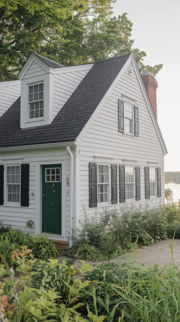
1. Timeless Whites and Neutrals
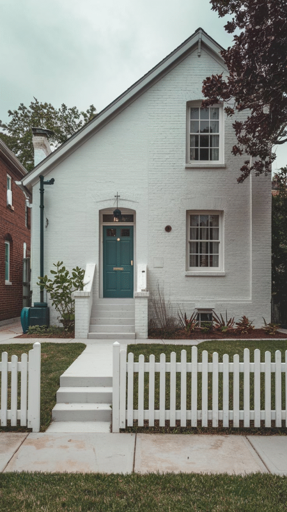
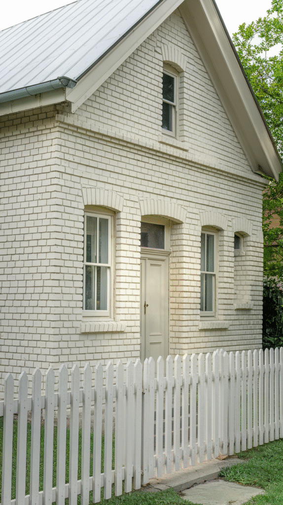
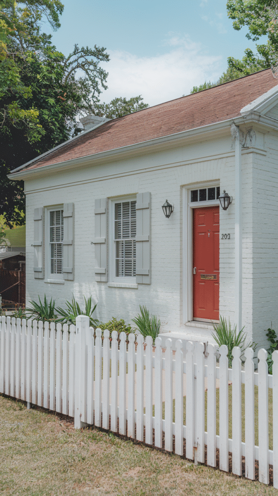
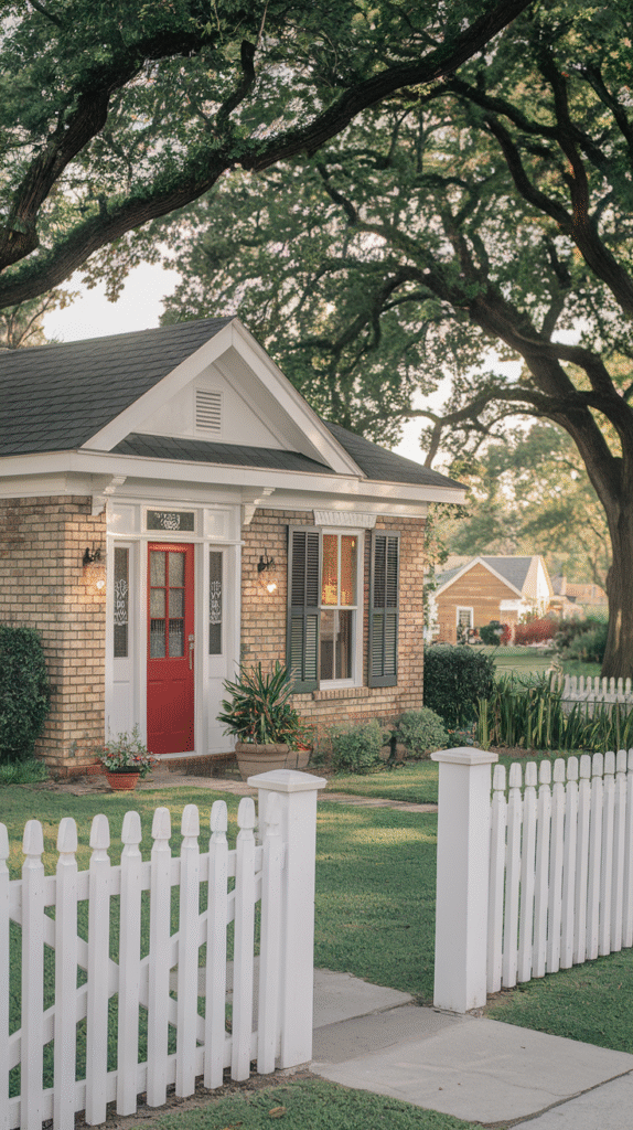
When it comes to simplicity and elegance, nothing beats a classic white exterior. Picture this: a white house with clean lines, accented with subtle gray or black trim. It’s like the little black dress of home exteriors—always in style.
White makes your home appear larger and more spacious, offering a crisp and fresh aesthetic that complements any surroundings. Add touches of natural wood for contrast, or opt for a bold front door in a bright color like red or navy to create a striking focal point.
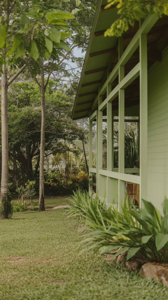
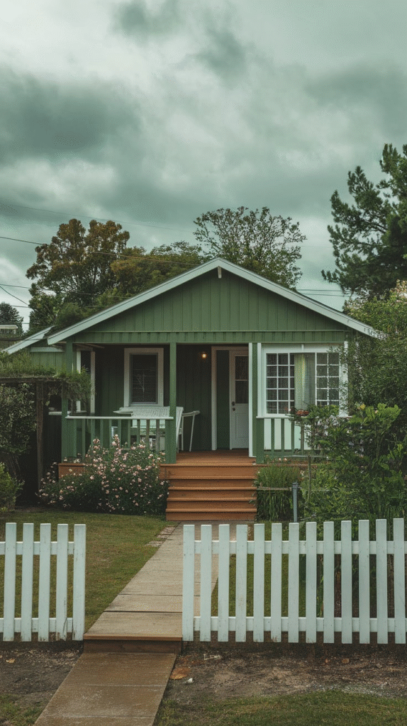
2. Earthy Greens with Dark Accents
If you’re looking to blend in with nature, earthy greens are a perfect choice. This palette brings a sense of tranquility, like a walk in the woods on a cool morning. Soft sage paired with darker olive or forest green accents can evoke a peaceful, grounded feel.
It’s the kind of palette that makes your home feel like a natural extension of the landscape. Throw in some natural stone or wood features to complete the organic vibe, and watch your home seamlessly blend into the surroundings.
3. Classic Gray with White Trim
Gray has been a favorite for a reason—it’s sophisticated, versatile, and endlessly chic. A soft gray exterior paired with clean white trim can create a subtle yet refined look. Think of it like a well-tailored suit—it’s professional but not stiff.
This palette works well in both modern and traditional settings, and you can play with various shades of gray, from cool tones like slate to warmer taupes. Add some greenery or colorful flowers in the garden to break up the neutral tones and add a pop of life.
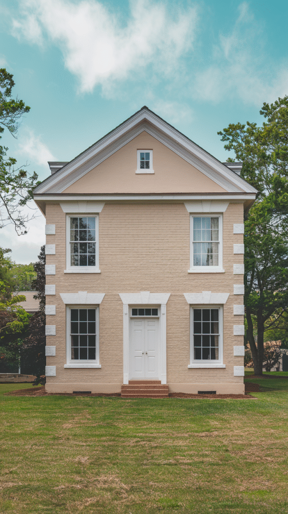
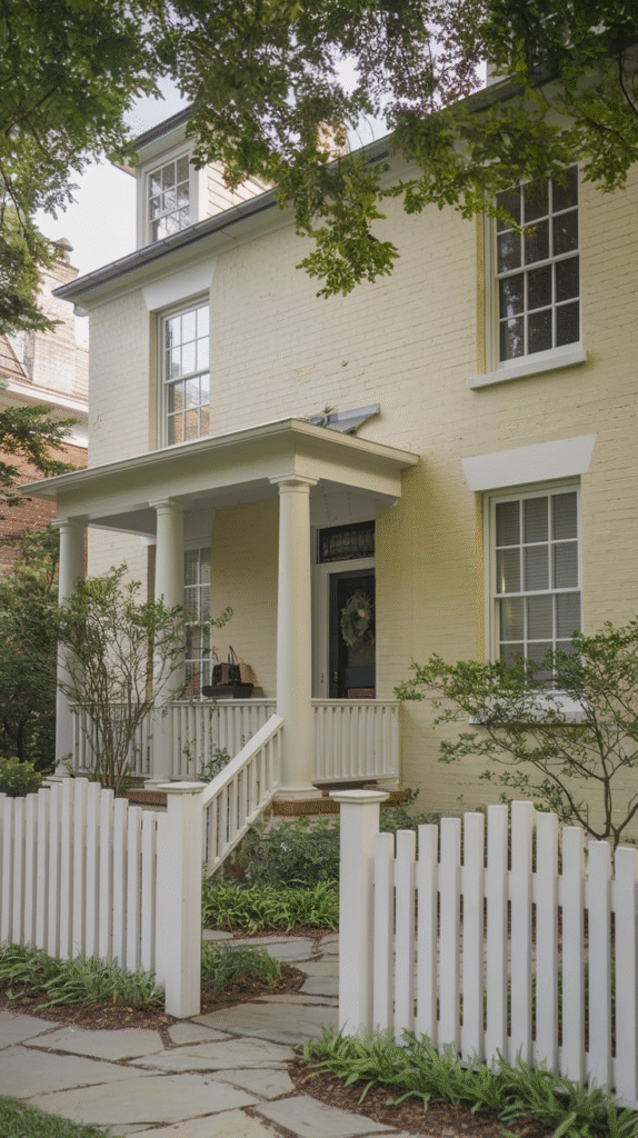
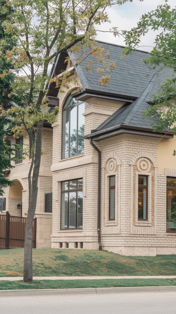
4. Warm Beige with Brown Undertones
For a more earthy and inviting vibe, warm beige tones mixed with brown undertones can create a welcoming, rustic feel. Imagine a cozy cabin tucked away in the mountains. This palette is perfect for creating a relaxed, comfortable atmosphere while still maintaining a polished exterior.
The warm tones make the home feel like a place you’d want to kick back and relax after a long day. Throw in some terracotta or wooden elements for added texture, and you’ll have an exterior that feels both refined and approachable.
5. Bold Navy and White
Navy blue is bold and timeless, like a classic denim jacket—it’s versatile and always makes an impact. Pairing navy with white creates a striking contrast that’s both elegant and eye-catching.
Whether you’re on the coast or in a suburban neighborhood, this color combo can make your home stand out in the best way possible. You can also introduce accents of gold or brass for a touch of luxury. With a navy blue base, your house will exude confidence and charm.
6. Soft Pastels for a Whimsical Charm
Soft pastel palettes—think light blues, soft pinks, and mint greens—offer a whimsical charm that’s perfect for cottages or beach houses. It’s like living in a postcard. These colors can transport you to a world where the sun always shines, and everything feels a little lighter.
Pair these pastel tones with natural textures, such as wood and stone, to keep it from feeling too sugary sweet. If you’re after a playful, cheerful vibe, pastel colors can bring a bit of joy and character to your home’s exterior.
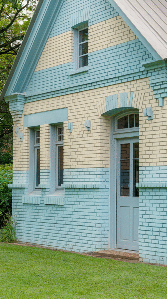
7. Muted Blues with Gray Accents
Muted blue tones, like powder blue or slate blue, paired with gray trim create an atmosphere of calm and serenity. This color palette evokes the feeling of a quiet, foggy morning by the sea. It’s peaceful, yet sophisticated, offering a timeless charm that works well in a variety of settings.
Add a few natural stone elements, or a wooden porch swing to bring even more texture and warmth to the design. This palette is especially perfect for homes near water, where the colors can mirror the surrounding natural beauty.
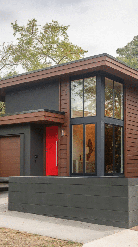
8. Charcoal with Metallic Accents
If you’re looking for a more modern and edgy exterior, charcoal gray with metallic accents might be your perfect match. Charcoal creates a sleek, industrial feel, while metallics like silver, bronze, or gold add a touch of sophistication.
It’s like the sleek black sports car of home design. This combination works particularly well in urban areas or in homes with modern architectural elements, where the dark exterior contrasts beautifully with the light sky or surrounding greenery. Add a bold statement front door or exterior lighting to really make the metallic accents shine.
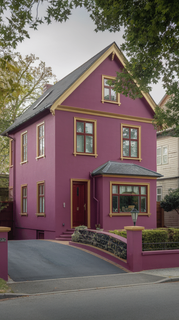
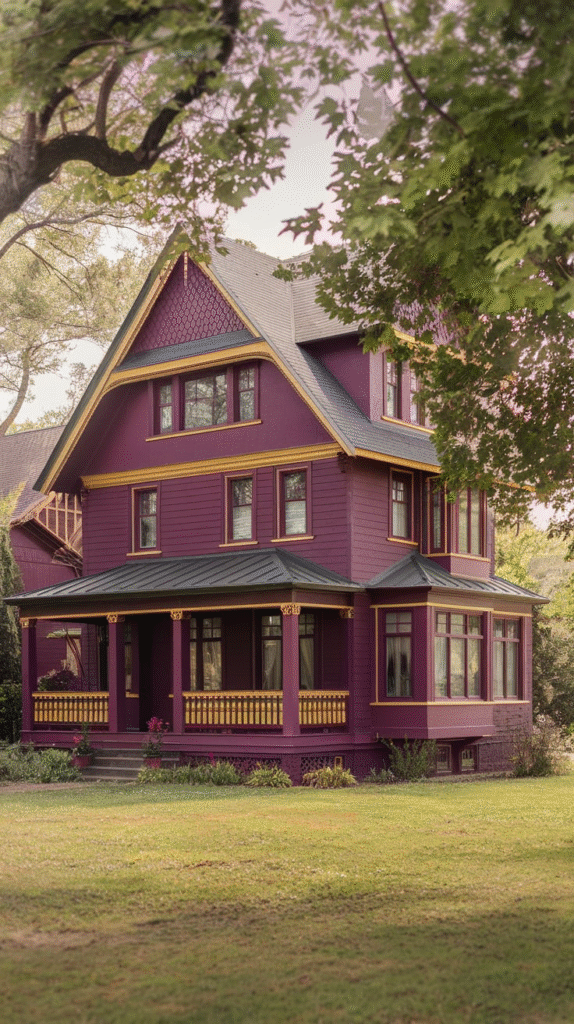
9. Rich Burgundy and Soft Neutrals

For those seeking a touch of drama and elegance, a rich burgundy exterior paired with soft neutrals like beige or ivory can create an opulent, old-world charm. Burgundy is a warm, deep color that makes a bold statement, yet the soft neutrals balance it out, preventing the palette from feeling too heavy.
Imagine your house as a cozy wine cellar—rich, inviting, and full of character. This combination works great in homes with traditional or vintage architectural features, giving your home a timeless, upscale feel.
10. Muted Terracotta with Cream Accents
Terracotta is a bold, earthy color that evokes a rustic, Mediterranean vibe. Paired with light cream or beige accents, it’s a combination that feels both grounded and refined. Imagine a charming villa nestled in the rolling hills of Tuscany, and you’ll get the idea.
This palette can work wonders for homes in warm climates, adding a bit of warmth to your surroundings while still looking polished. Consider adding wrought-iron features or terracotta roof tiles to bring the Mediterranean aesthetic to life.
11. Soft Taupe with Greenery
Soft taupe is one of those colors that’s understated yet elegant. It provides a neutral backdrop that allows other elements, such as plants and flowers, to shine. When paired with greenery like ivy or potted plants, taupe creates a sense of serenity and balance.
It’s the kind of color scheme that feels timeless and natural, making it perfect for suburban homes or those in rural areas. Soft taupe’s subtlety allows your landscaping to take center stage while still keeping the exterior of your home warm and inviting.
12. Cream and Charcoal Gray
For a chic and contemporary look, combine cream with charcoal gray. The creamy, light base makes the home feel open and airy, while the charcoal gray accents provide depth and sophistication. This pairing offers the best of both worlds—light and dark, modern and classic.
Think of it as a crisp winter morning with the contrast of soft snow and dark shadows. This color scheme works particularly well in modern homes, where the clean lines of the architecture can really shine through.
13. Olive Green with Black Trim
Olive green is a color that feels rich and luxurious, yet still down-to-earth. When paired with black trim, it takes on a bold, sophisticated feel. This combination is perfect for those looking to make a statement without being too flashy.
Imagine the deep green of a forest combined with the sharp contrast of black—there’s something undeniably striking about it. This color palette works especially well in homes with mid-century modern or industrial designs, where the muted tones complement the architectural elements.
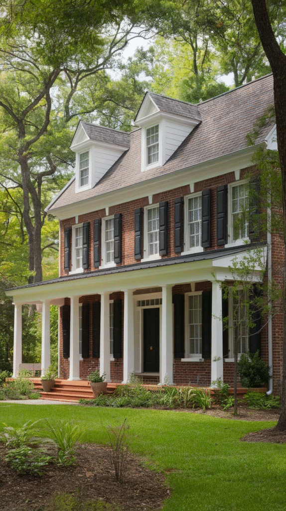
14. Chocolate Brown and Warm Whites
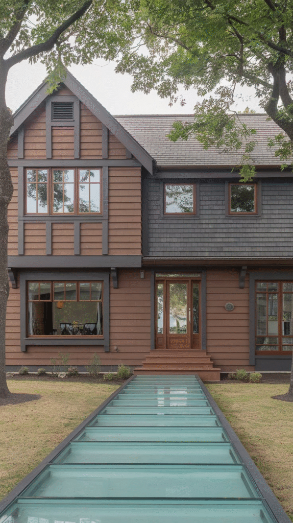
Chocolate brown is a deep, comforting color, like a warm cup of coffee on a cold day. Pairing it with warm whites creates a rich, inviting atmosphere that feels cozy and timeless. This combination is perfect for homes that want to feel grounded yet sophisticated.
The warmth of the brown balances the freshness of the white, making it a great option for traditional and modern homes alike. Add some natural wood elements to bring in more texture and warmth, and you’ll have a home that’s both stylish and cozy.
15. Sunset Oranges and Soft Grays
If you want to add a pop of color without going overboard, consider combining warm sunset oranges with soft gray accents. The orange tones evoke a sense of energy and excitement, while the gray tones keep the palette grounded and sophisticated. It’s like a warm summer sunset right at your doorstep. This color combination works especially well in coastal or desert homes, where the warmth of the oranges complements the natural surroundings.
16. Rich Forest Green and Cream
For a home that exudes elegance and luxury, a rich forest green exterior paired with creamy white accents is a winner. Forest green brings a sense of grandeur and timelessness, while cream adds a soft, delicate contrast. This palette works well in areas surrounded by lush greenery, as it allows the home to blend seamlessly with its natural environment. Throw in some natural stone or brick features to add texture and warmth, and you’ll have a home that feels both stately and inviting.
17. Soft Lavender with Charcoal
For a more whimsical and unique exterior, consider pairing soft lavender with charcoal gray. Lavender is a soothing, calming color that’s not too bold, but when combined with the depth of charcoal, it creates a harmonious balance.
This combination is perfect for a modern cottage or a home with a bit of charm and character. The lavender brings a sense of calm and beauty, while the charcoal adds sophistication and contrast.
18. Bright Yellow with Gray
If you want your home to stand out in the best possible way, bright yellow paired with gray can create a dynamic and cheerful exterior. Yellow is a color that exudes positivity and energy, and when paired with the coolness of gray, it becomes bold without being overwhelming.
This palette is perfect for homes in sunny climates, where the yellow can really shine against the bright sky. Add some colorful flowers or plants around the house to enhance the playful vibe.
19. Muted Lavender and Soft Neutrals
Muted lavender, paired with soft neutrals like beige or taupe, creates a refined, sophisticated exterior with just a hint of playfulness. It’s perfect for homes that want to evoke a sense of calm and elegance, with a touch of charm.
This combination works particularly well for modern cottages or homes that blend contemporary and classic elements. The lavender adds a unique twist to the traditional neutrals, creating a balanced and inviting palette.
20. Cool Teal with White Accents
Cool teal can create a refreshing and vibrant look for your home’s exterior. It’s like the color of the ocean on a clear day, evoking a sense of relaxation and freshness. When paired with crisp white accents, teal feels even more lively and inviting. This color combination works especially well in coastal areas or homes with a beachy vibe, where the colors complement the surrounding natural beauty.
21. Rich Plum and Gold
If you’re looking for something truly luxurious and bold, a rich plum exterior with gold accents is a showstopper. Plum brings a deep, regal feel, while the gold adds a touch of opulence. It’s like stepping into a royal palace, and it’s sure to make your home the talk of the neighborhood.
This palette works especially well for large, stately homes or properties that have a historical or traditional architectural style. Add some elegant landscaping elements to complete the look, and you’ll have a home that feels like a million bucks.
Conclusion
There you go! 21 color palettes to inspire your exterior transformation. Remember, your home’s exterior should feel like an extension of yourself—bold, welcoming, and timeless. Take your time to choose the combination that feels right, and don’t be afraid to experiment with contrasts and accents. After all, this is your canvas, so paint it with personality and style.