26 Interior Paint Colors Ideas
Ever stared at a blank wall and felt like it was silently judging your indecision? Picking the right interior paint color is a little like choosing the perfect outfit for your home—it’s got to fit just right, flatter every corner, and feel like you.
Whether you’re craving bold drama or whisper-soft tranquility, the right hue can completely transform your space. So grab your mental paintbrush and let’s dive into 26 of the best interior paint colors you can use to breathe personality into your walls.
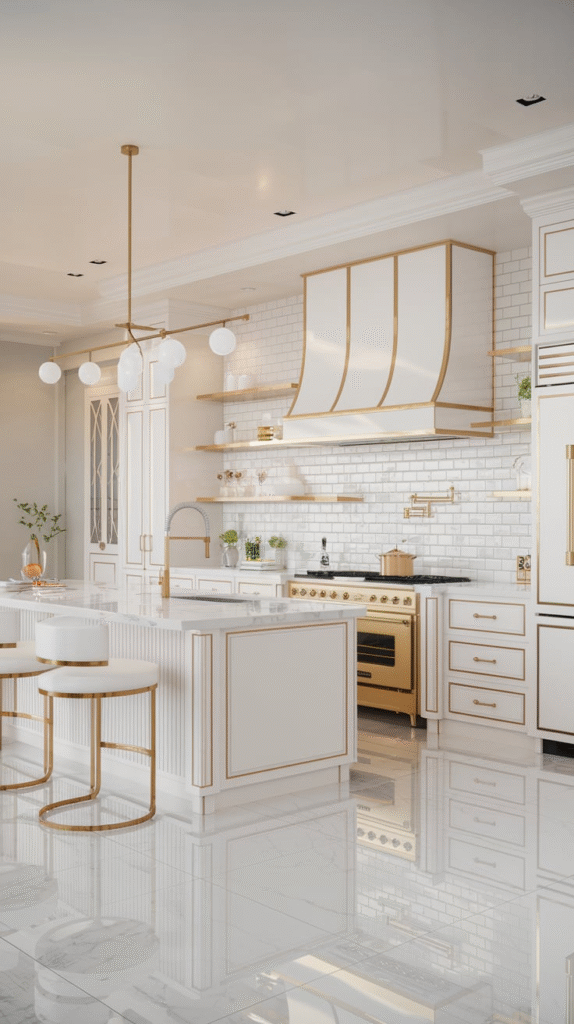
1. Classic White: The Little Black Dress of Paint
There’s a reason crisp white walls have stood the test of time. They’re clean, airy, and adaptable. Think of white as your blank canvas—perfect for showcasing artwork, contrasting furniture, or simply letting light bounce around the room. A soft matte finish can add warmth, while high-gloss gives a modern edge.
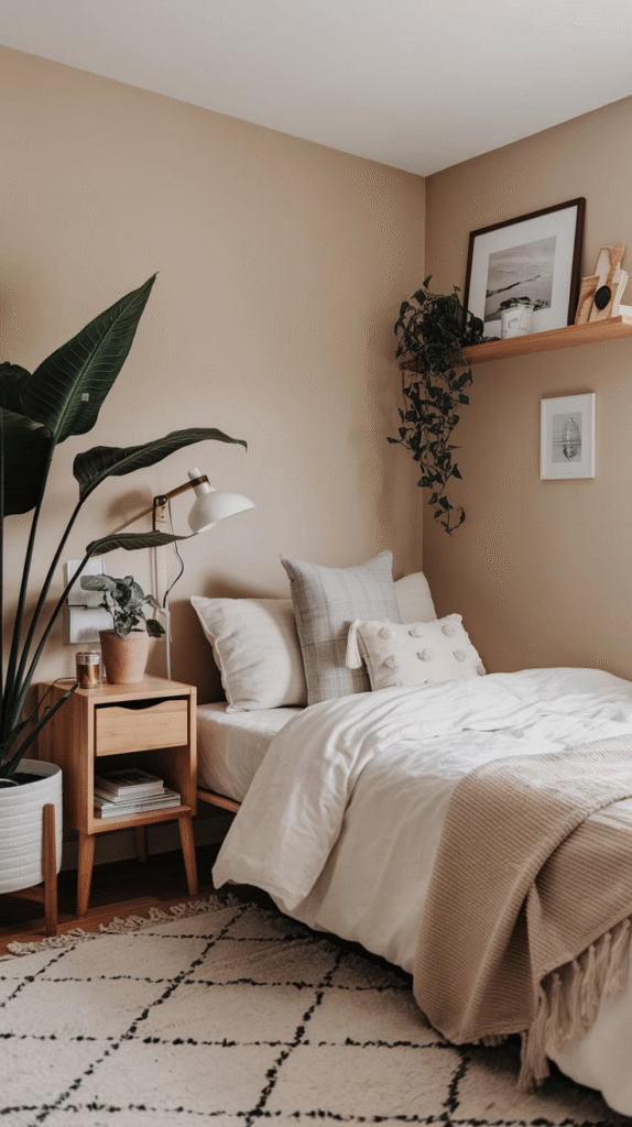
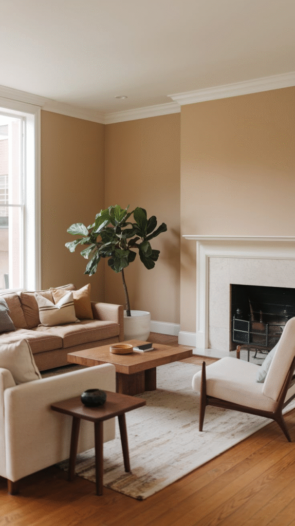
2. Greige: The Neutral Whisperer
Greige (a mix of gray and beige) is like that friend who fits in anywhere. It offers the warmth of beige with the cool sophistication of gray, making it ideal for living rooms or bedrooms where you want to keep things cozy without going full-on rustic.
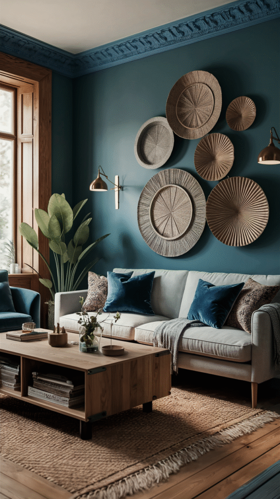
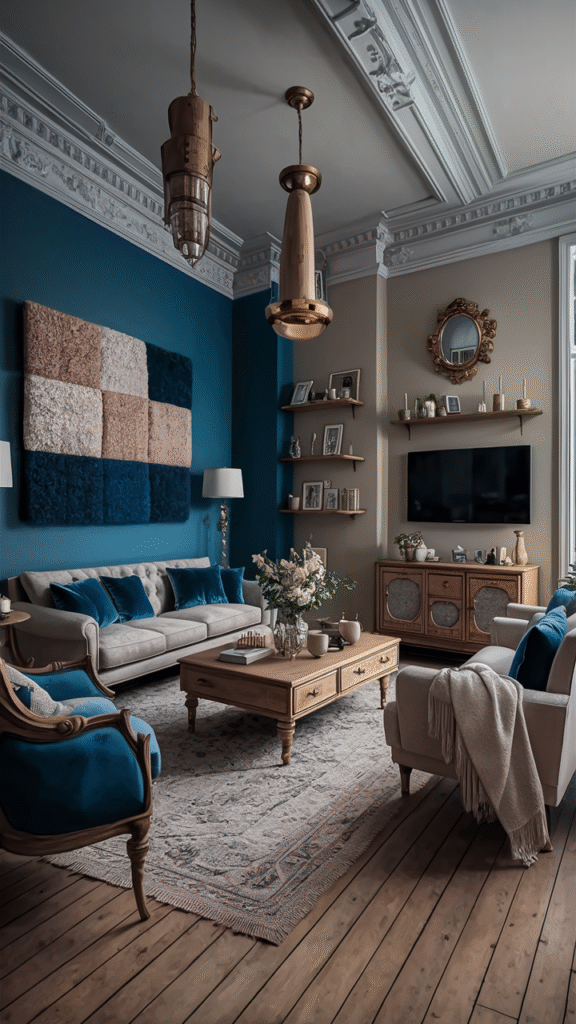
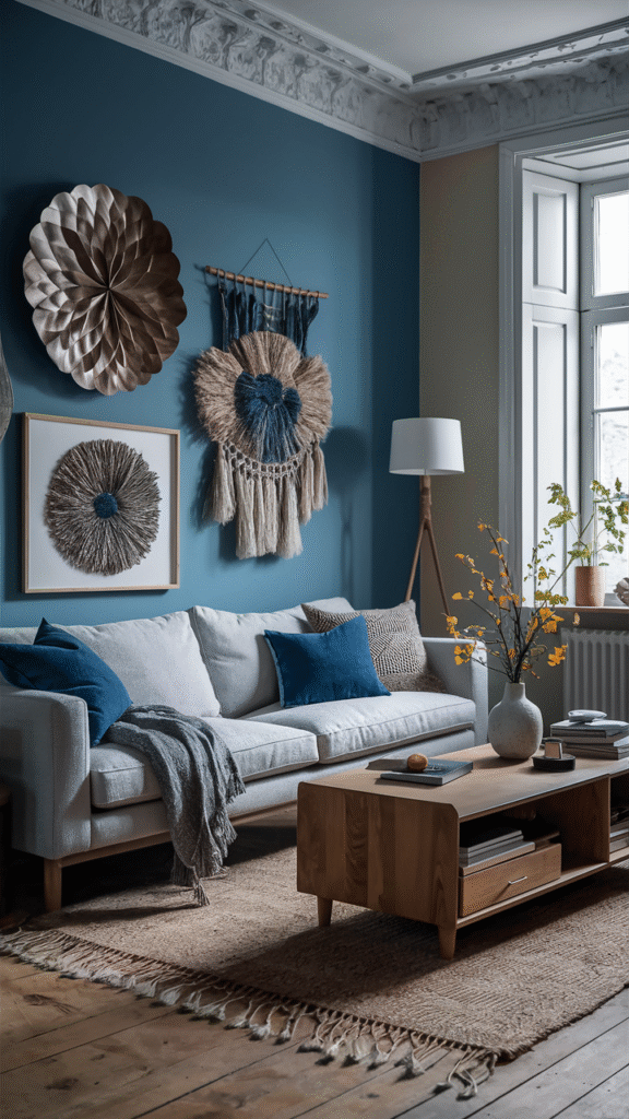
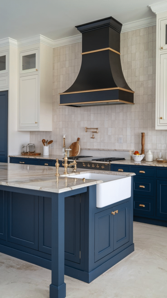
3. Navy Blue: The Moody Gentleman
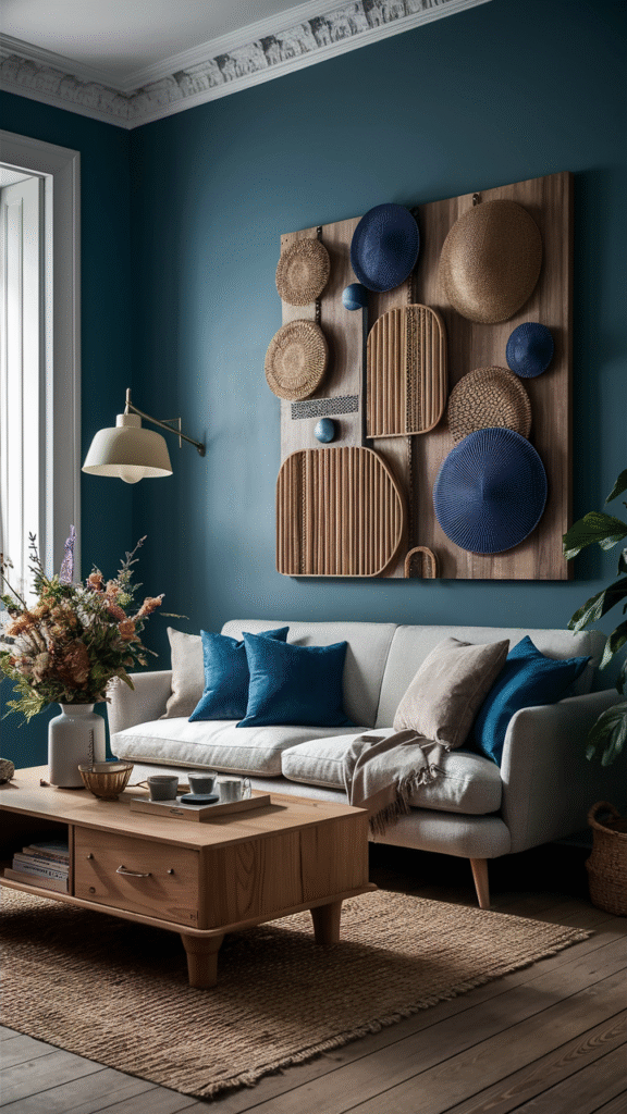
Want drama without going full goth? Navy blue brings a sophisticated richness to any room. Use it in a dining room for an elegant evening vibe or in a library or office for some seriously grown-up charm. Bonus: it pairs beautifully with brass fixtures and crisp white trim.
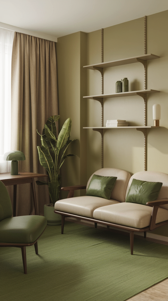
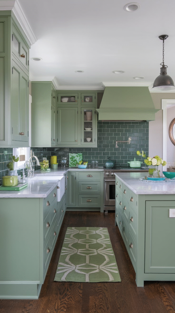
4. Soft Sage Green: Nature’s Whisper
Walking into a room painted in sage green feels like a deep exhale. It brings the outdoors in without overwhelming your senses. Great for kitchens, bathrooms, or anywhere you want to evoke a calm, natural feel. Pair with rattan, wood tones, or soft linen for peak tranquility.
5. Dusty Rose: The Grown-Up Pink
Dusty rose is pink with a passport and a glass of wine. It’s mature, stylish, and unexpectedly versatile. Use it in a bedroom for romantic warmth or in a bathroom for a pop of color that doesn’t scream Barbie’s Dreamhouse.
6. Charcoal Gray: The Moody Minimalist
If your heart says black but your head says “let’s be practical,” charcoal gray is your compromise. It’s bold, dramatic, and surprisingly flexible. Works wonders in modern interiors, especially when layered with soft textures and metallic accents.
7. Sky Blue: The Daydreamer’s Delight
There’s something inherently soothing about sky blue. Like lying on a picnic blanket and watching the clouds drift by. Perfect for bedrooms, nurseries, or bathrooms, this color instantly makes a room feel open, airy, and full of possibility.
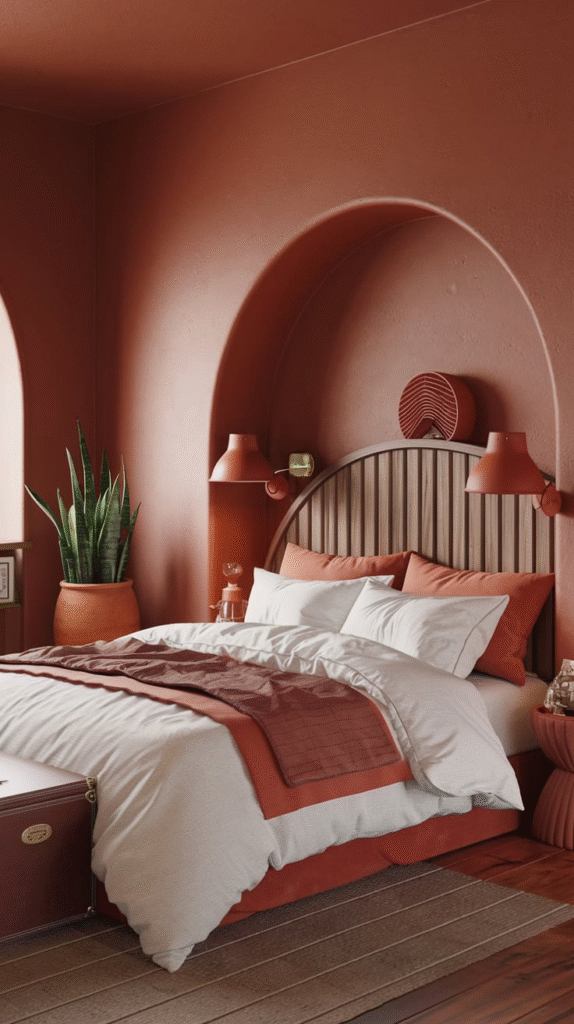
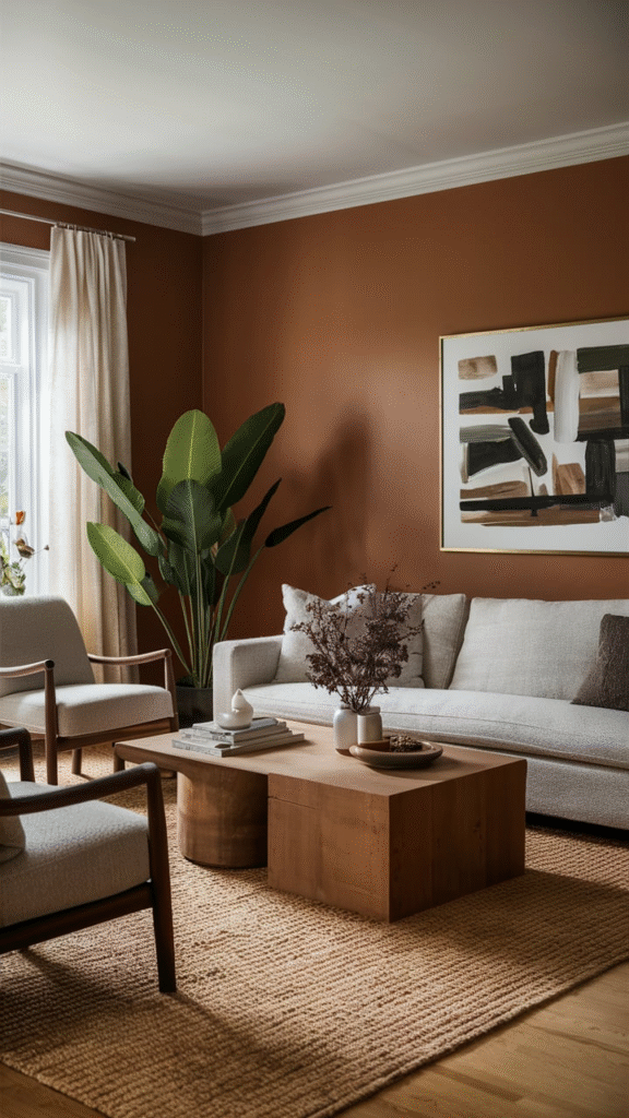
8. Terracotta: Warm Earth Between Your Toes
Terracotta is more than just pottery—it’s a grounded, sun-kissed color that brings warmth to any space. Ideal for accent walls or cozy living rooms, this color sings when paired with deep greens, creamy whites, or patterned textiles.
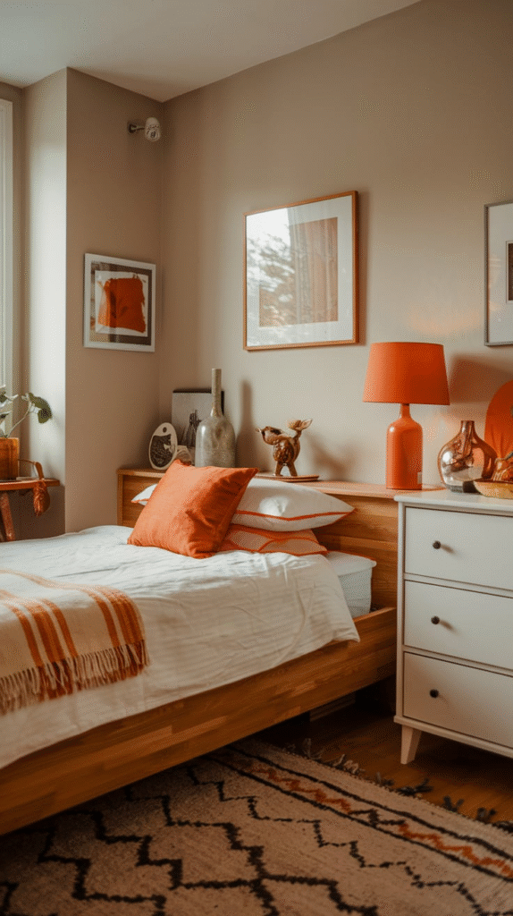
9. Buttercream Yellow: Sunlight in a Can
Buttercream yellow gives you the sunshine you need, even on cloudy days. Not as in-your-face as lemon or mustard, it’s a gentle glow that adds instant warmth to kitchens, breakfast nooks, or anywhere family gathers.
10. Soft Lavender: The Serene Rebel
Who said pastels can’t be bold? Lavender, especially the muted, gray-toned variety, brings an unexpected freshness to bedrooms or bathrooms. It’s both calming and a little edgy—like a yoga teacher with a motorcycle license.
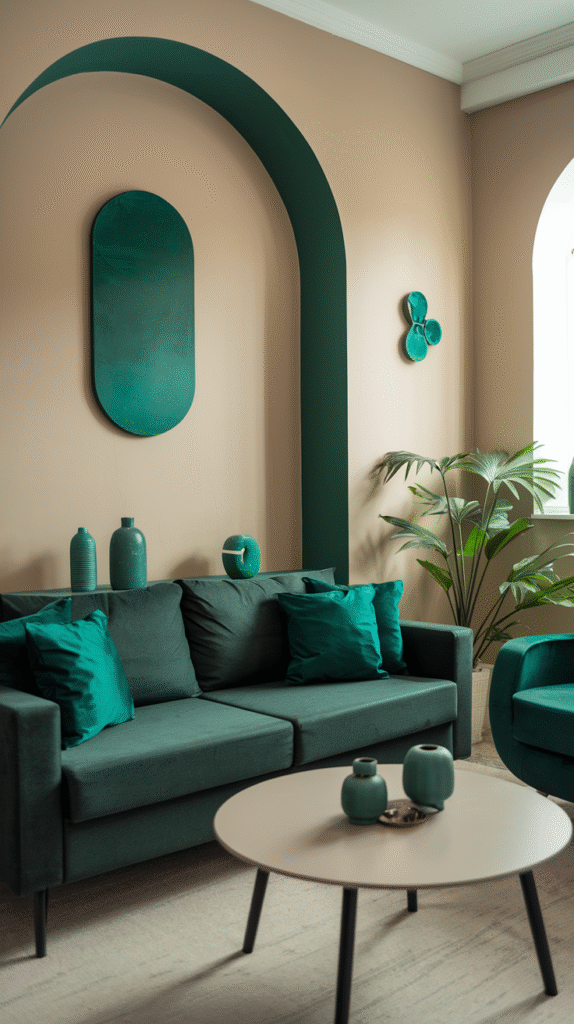
11. Teal: The Deep Sea Explorer
Teal is adventurous but grounded, like diving into the ocean and finding a secret world below. Use it in a hallway or office to make a statement without going overboard. It’s especially striking with gold accents and crisp trim.
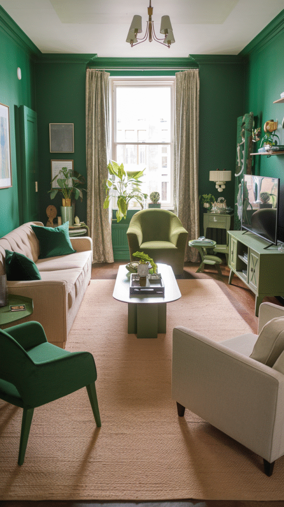
12. Olive Green: The New Neutral
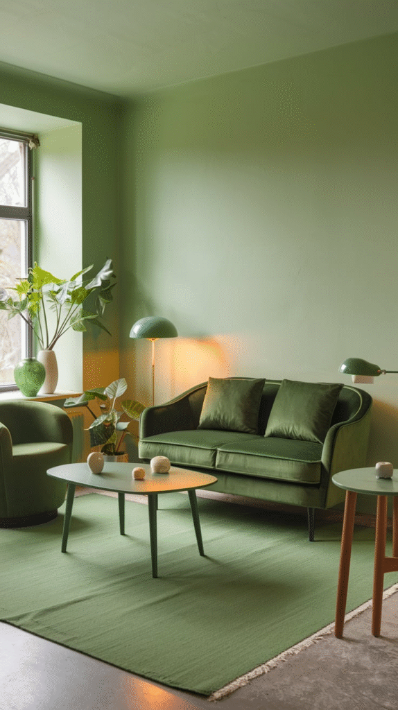
Olive green might sound intense, but it acts like a sophisticated neutral—less expected than beige, but just as flexible. It works beautifully in dining rooms or kitchens, especially with wooden cabinetry or terracotta tile.
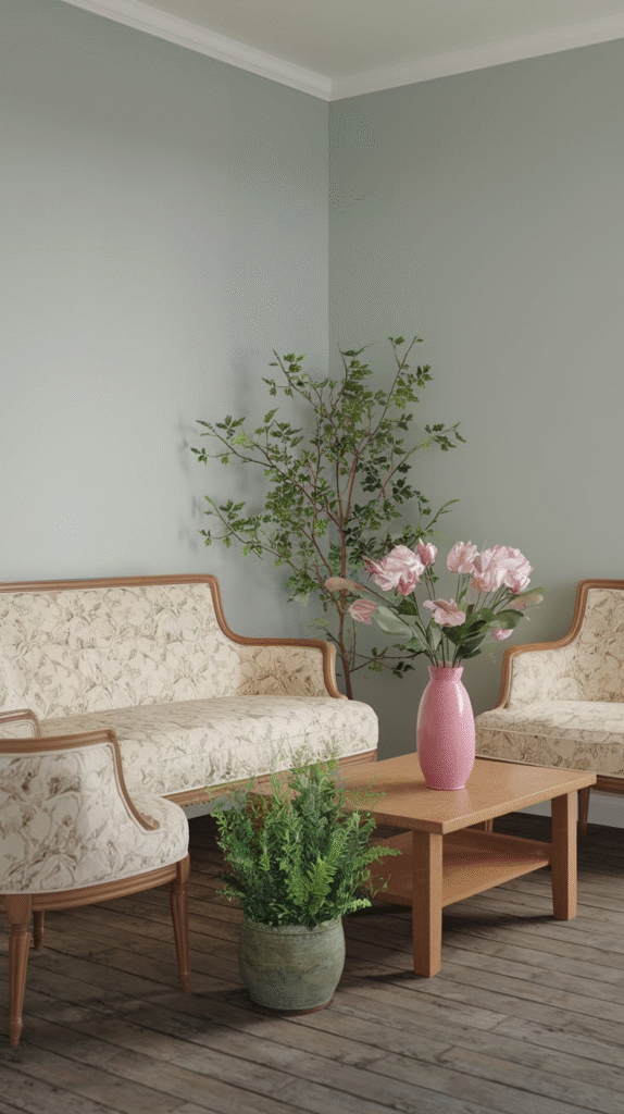
13. Blush Pink: The Soft Spoken Charmer
Blush is having a moment—and for good reason. It’s soft, flattering, and adds just the right amount of warmth to a room without being saccharine. It’s particularly lovely in bedrooms or nurseries, paired with white, brass, or gray.
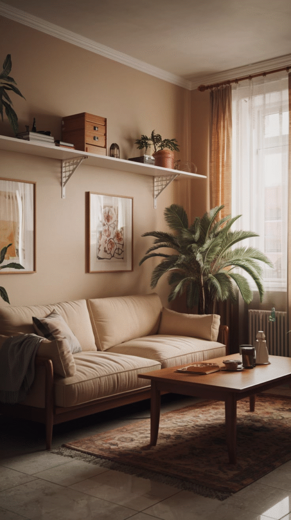
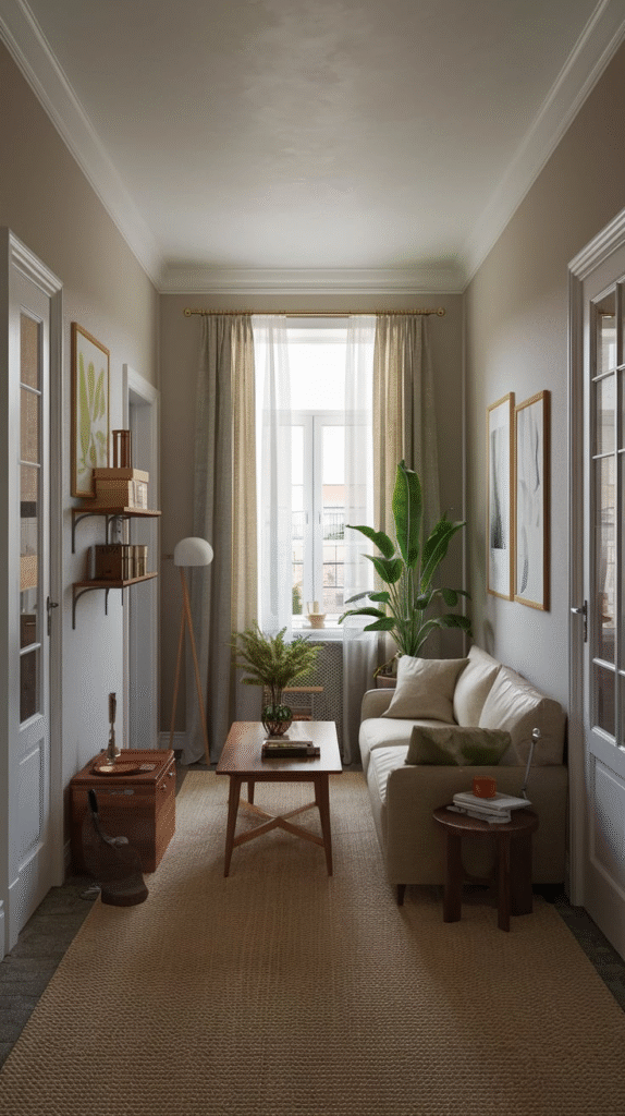
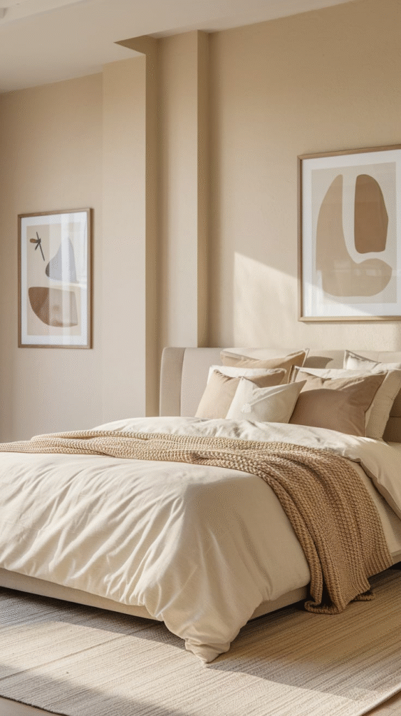
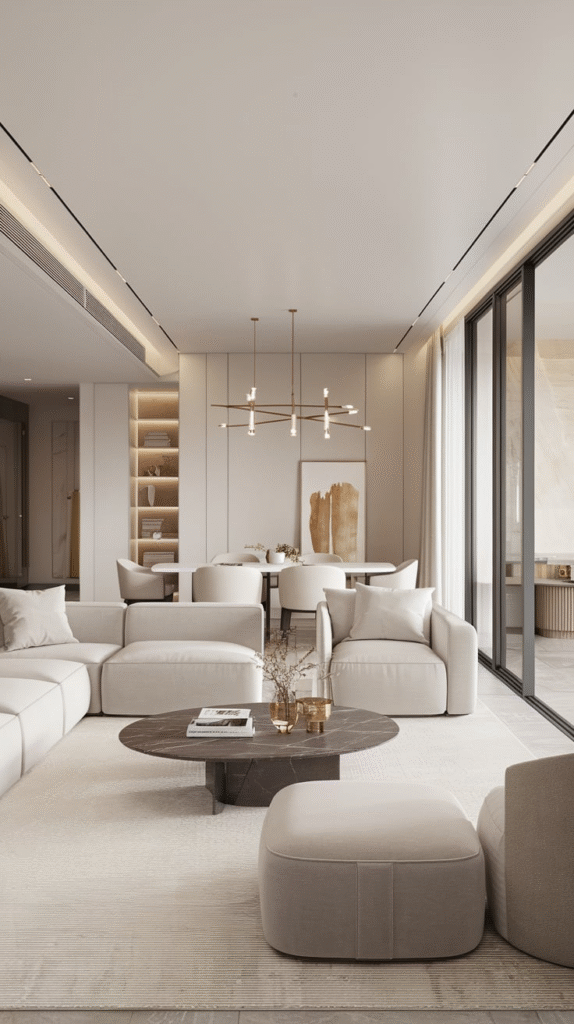
14. Warm Taupe: Cozy, Not Boring
When beige and brown had a stylish baby, they named it warm taupe. It brings an inviting richness to walls without stealing the spotlight. Great for living rooms or hallways where you want continuity with a hint of comfort.
15. Black: Bold, Brave, Beautiful
Painting a wall (or a room!) black might seem like an interior design dare—but done right, it’s deeply elegant. It adds contrast, grounds a space, and can even make smaller rooms feel more expansive. Keep lighting and furniture light for balance.
16. Mustard Yellow: The Retro Star
There’s something unapologetically cheerful about mustard yellow. It’s a little retro, a little daring, and entirely warm. Use it in accent walls or kitchens, and pair with navy, charcoal, or wood tones for a cozy-cool aesthetic.
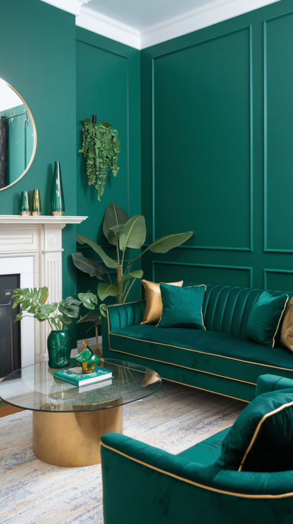
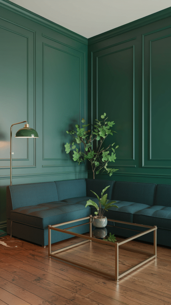
17. Forest Green: Deep and Thoughtful
Walking into a forest green room is like stepping into an old library—you instantly want to curl up with a book and a blanket. This color feels wise, rich, and grounded. Ideal for studies, bedrooms, or statement walls.
18. Ice Blue: A Breath of Fresh Air
If you’ve ever wanted your room to feel like a crisp morning breeze, ice blue is your ticket. Cool, clean, and endlessly refreshing, this shade is great for bathrooms or bedrooms, especially paired with white or pale wood accents.
19. Clay: The Artisan’s Touch
Think of clay as terracotta’s subtle cousin. Earthy, warm, and grounding, it brings a handcrafted, artistic vibe to interiors. It’s gorgeous in living rooms or reading corners, layered with textured fabrics and rustic accessories.
20. Pale Peach: Soft But Not Shy
Pale peach might sound sweet, but it has backbone. This hue adds warmth without turning up the volume too high. Ideal for entryways or small spaces where you want a hint of personality without overwhelming the eye.
21. Pewter: Not Quite Silver, Not Quite Gray
Pewter walks the line between metallic and matte, offering depth without darkness. It’s a great choice for dining rooms or bedrooms where you want a rich, enveloping feel without going full charcoal.
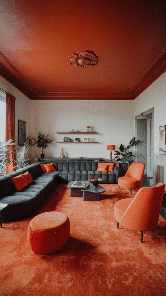
22. Coral: The Life of the Party
Coral is a warm, energetic hue that sparks creativity and joy. Great in creative spaces like studios or home offices, it wakes up the senses while still playing nice with neutrals and soft woods.
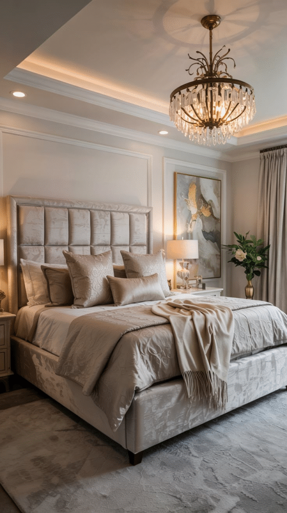
23. Warm White: The Toasted Marshmallow
Unlike sterile, stark whites, warm white has a creamy undertone that feels like a soft hug. It’s an easy win for anyone who wants a clean aesthetic without the clinical vibe. Works everywhere, from hallways to bedrooms to ceilings.
24. Cerulean Blue: Coastal Cool
Cerulean brings the beach home without the sand in your shoes. It’s fresh, clear, and a little nostalgic—perfect for bathrooms, guest rooms, or any space that needs a bit of cheerful escape.
25. Mauve: The Hidden Romantic
Mauve is what happens when purple grows up. It’s gentle, romantic, and just a little mysterious. Great for bedrooms or powder rooms where you want subtle luxury with a twist of the unexpected.
26. Mocha: The Comfortable Sophisticate
Mocha is warm, rich, and as comforting as your morning coffee. It’s a sophisticated shade that works beautifully in dens, family rooms, or anywhere you want a cocoon-like atmosphere.
Conclusion
Here’s the deal—paint is powerful. It can shape a room’s mood, express your personality, and even influence your daily mindset. But choosing the right shade isn’t about following trends; it’s about finding what speaks to you. Think of your home as your personal gallery, and each color as a brushstroke that tells your story.
I once painted my bedroom a deep navy on a whim. Friends thought I’d lost it. “You’ll feel like you’re sleeping in a cave,” they warned. But instead, I felt grounded, peaceful, like the world had been dialed down just enough for me to breathe. That’s what the right paint can do—it shifts your space and your soul.